UPDATE: I rode a bike from Lafayette Street to the Hudson River today. At the beginning of the ride I looked up Broadway and saw the top of the Chrysler Building. At Fifth Avenue the Empire State Building came into view. Seeing those two towers was like seeing old friends.
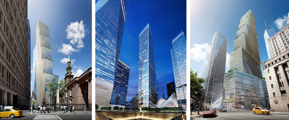
At Seventh Avenue, One World Trade Center hove into view. It was an alien intruder, photobombing Greenwich Village. There is a place for glass buildings in New York, and Two World Trade Center will be the best of the bunch at Ground Zero, but the behemoths already built make so many parts of New York suffer from their monotonous bulk.
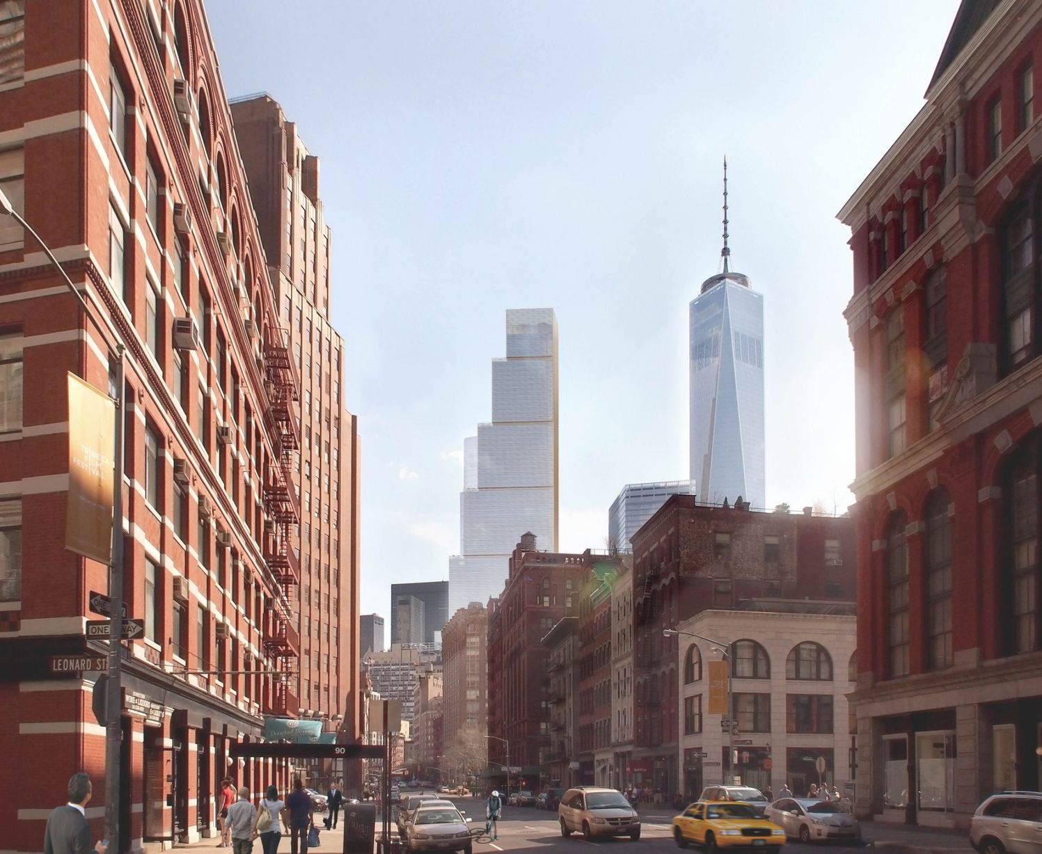
A FRIEND WHO LIVES IN TRIBECA calls this “BIG Photobombs Tribeca.” Bjarke Ingels (the “BI” in “BIG”) calls it uniting “the streetscapes of Tribeca with the towers downtown.”
Since this is my second post in two days about this building, let me point out up front that I’m not saying BIG are bad architects. They’re obviously clever and frequently have interesting ideas. If this building were in Singapore or perhaps the Pudong section of Beijing, I might like it. I might even like it if it were part of Hudson Yards, but in the context of downtown New York, I think it’s an alien intruder.
The buildings in the front of the photo above have human scale, craft, and a simple beauty that comes from composition, rhythm, proportion, and ornament. The deep masonry walls have a play of light and shadow: the result is a firmness and solidity that effectively contain the space between the buildings and shape the street into a comfortable place to be. Together, the buildings make a public realm where we enjoy being and interacting.
The shiny towers in the background are most interesting at a distance (BIG’s tower is visually interesting, the other one, not so much). As you approach them they become less interesting, because they have a repetitive and monotonous glass skin that will be made in China, designed to be locally assembled without skilled labor.
There is no human scale in the design of the building, and more importance was given to the tower as object than a building that shapes the public realm. Compare it to the Empire State Building or the nearby Woolworth Building (each once the tallest tower in the world), to see how differently we react to towers that are designed at different scales for different viewers. The Woolworth Building is beautiful and appealing on the skyline and beautiful and appealing to the man or woman on the street. And its masonry and more finely detailed top relates better to the old buildings around it than the shiny towers.
The views below come from BIG. Their video is spectacular, but these views make me think that the tower will be an alien invader up close as well as from Tribeca. A problem with today’s “cutting edge” architecture—which usually would be more accurately described as the architecture of global capitalism—is that it has a such a limited range of architectural expression and character that it often has a hard time fitting in at the party. BIG knows how to dream up exciting concepts, but not how to fit into different contexts.
“Ninety-eight percent of the people who hang out in our restaurants hate glass towers”
Selling Snow to Eskimos
