Santa Fe, New Mexico is the most beautiful city of the 20th century. This simple statement requires some explanation.
First of all, it’s not the equal of Renaissance Florence or Baroque Rome—but neither are any other American cities built in the 20th century. After 1930 or so, the 20th century was the century of Modernism, and the principles of Modernism never produced a beautiful city in the US. In fact, although there are quite a few Modernist buildings that are works of genius, and many more that fit well enough into the city, there are few Modernist places that are even good. A place requires a building so large it makes outdoor spaces contained enough that we feel good in them, or an assemblage of buildings that shapes a public realm that we want to be in.
Second, most of us think that Santa Fe is a very old place, perhaps the oldest place in the United States. In fact, everything we see in the “historic center” of Santa Fe has been built since 1912, when New Mexico became a state. The heart of Santa Fe, the Plaza, has been rebuilt, and every building facing it is either new or fundamentally different than it was at any time before 1912. That includes, as we shall see, the “oldest building in America,” the Governor’s Palace on the north side of the Plaza.Third, when I say Santa Fe is the most beautiful city of the Twentieth Century, I am excluding the peripheral parts of Santa Fe that have been built since the 1970s, when the city hired a modern planner to make Santa Fe a modern city.
That was the beginning of the process that gave Santa Fe the physical accouterments of Modern Life: the arterial avenues and collector roads the modern planner and the traffic engineer have used to create the modern, auto-dependent life we have substituted in the last 50 years for the traditional city so evident in the center of Santa Fe.
In many ways, the parts of Santa Fe that have been built on these roads since then are indistinguishable from what Jim Kunstler calls the National Automobile Slum. Visually, they are a bit different than what is built in the rest of America, because the buildings are built with stucco and “synthetic” stucco in an adobe color that refers to the older parts of Santa Fe. But spatially, they learn nothing from the example of the center of Santa Fe and have the same mind-numbing, soul-impinging voids of sprawl development everywhere.
These barren roads spread malignantly into the soul-stirring New Mexican high desert, simultaneously destroying the city and the country, while supporting the confused contemporary idea that the country is sacred and the city profane.
In one of the Western capitals of the New Age, Santa Fe, to be spiritual means to live on one of the ranchitos that have done so much social, environmental, economic and spiritual damage to Santa Fe and its surroundings.
If we could go back and visit Santa Fe in 1898, when it was still part of a United States territory encompassing both New Mexico and Arizona, we would find a poor, dirty, provincial small town dominated by a Victorian plaza. Between 1890 and 1910, economic prospects were so bad that the population went down by more than 20 percent, to a low of 5,072.
By 1912, the Plaza had been rebuilt many times, most recently in generic American Victorian style, after New Mexico became a U.S. territory governed by the military. In 1913, American archaeologists and architects rebuilt the Palace of Governors that sat on one side of the Plaza.
The original building was started more than 300 years before that in 1610, but the periodic alterations erased virtually all traces of the first Spanish building. Much of what remained was destroyed by one of the military commanders, who made the interior look like the lobby of a Victorian hotel.
The 1913 reconstruction ripped out walls, both old and new. In the process, more than a thousand cubic yards of building material and refuse were carried out, and the building was rearranged to make an archaeological museum in a local style.
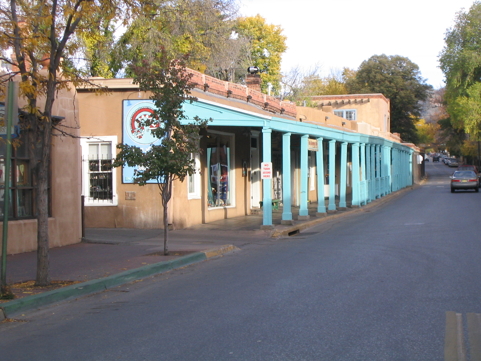
The Victorian, semi-classical portico that ran along the Plaza side of the Palace of the Governors was replaced with a contemporary interpretation of the traditional Santa Fe portal, a porch and arcade that sheltered people using the Plaza from the strong Santa Fe sun.
Today we know that the portal on the Palace of the Governors is traditional but historically inaccurate — no other portal quite like it had ever been built in New Mexico, let alone on the Palace of the Governors.
But its unprecedented combination of simple yet sophisticated details from the regional traditions and materials of the Spanish and the Pueblo Indians started the Santa Fe style that transformed the city that we see today. The transformation of the rest of the Plaza with the portals that seem so beautiful and historic didn’t finish until 1966.
At roughly the same time in the 60s, the city was told that in order to avoid the death of the downtown, they had to follow modern planning ideas and build an up-to-date arterial road system into the downtown. What’s interesting about this is that the downtown was thriving, and the arterial roads designed to help people into the city were more effective in getting people out of the city and onto new ranchitos, simultaneously harming the downtown and the landscape.
Santa Fe sits at the base of a 13,000-foot mountain in the middle of an extraordinary, soul-stirring landscape whose special and even magical qualities have always attracted people to the area.
But Santa Fe is now surrounded by a slightly prettier, stucco version of the same soul-deadening sprawl that surrounds every other U.S. city. And its extraordinary juxtaposition of a beautiful compact city in a fantastic landscape is steadily eroded.
Before the roads — planned by graduates of MIT who had studied with the most prestigious planner of the day, Kevin Lynch — Santa Fe’s central Plaza was one of the great urban experiences of America. On the Plaza were restaurants, the post office, Woolworth’s, a great bookstore, clothing stores, a bank and a hotel that functioned as a social center for a very high percentage of the local population. Many people went there every day for coffee in the lobby, decades before the establishment of Starbucks.
Today many of the ranchito dwellers realize they’ve lost all communal life. Most of them aren’t yet ready to give up their 5 acres, but they wish they had a reason to go to the Plaza — and there are precious few. Most of the “galleries” sell gee-gaws that only a tourist would buy.
The new roads enabled the cheap, subsidized construction of new stores that must total five to ten times more commercial space than exists downtown, drastically hurting the traditional stores there. And ironically, the only traffic jams in Santa Fe are on the new arterials because, of course, when you create a system in which everyone must drive everywhere for everything and then concentrate that traffic on a few collector roads, every intersection inevitably becomes a bottleneck.
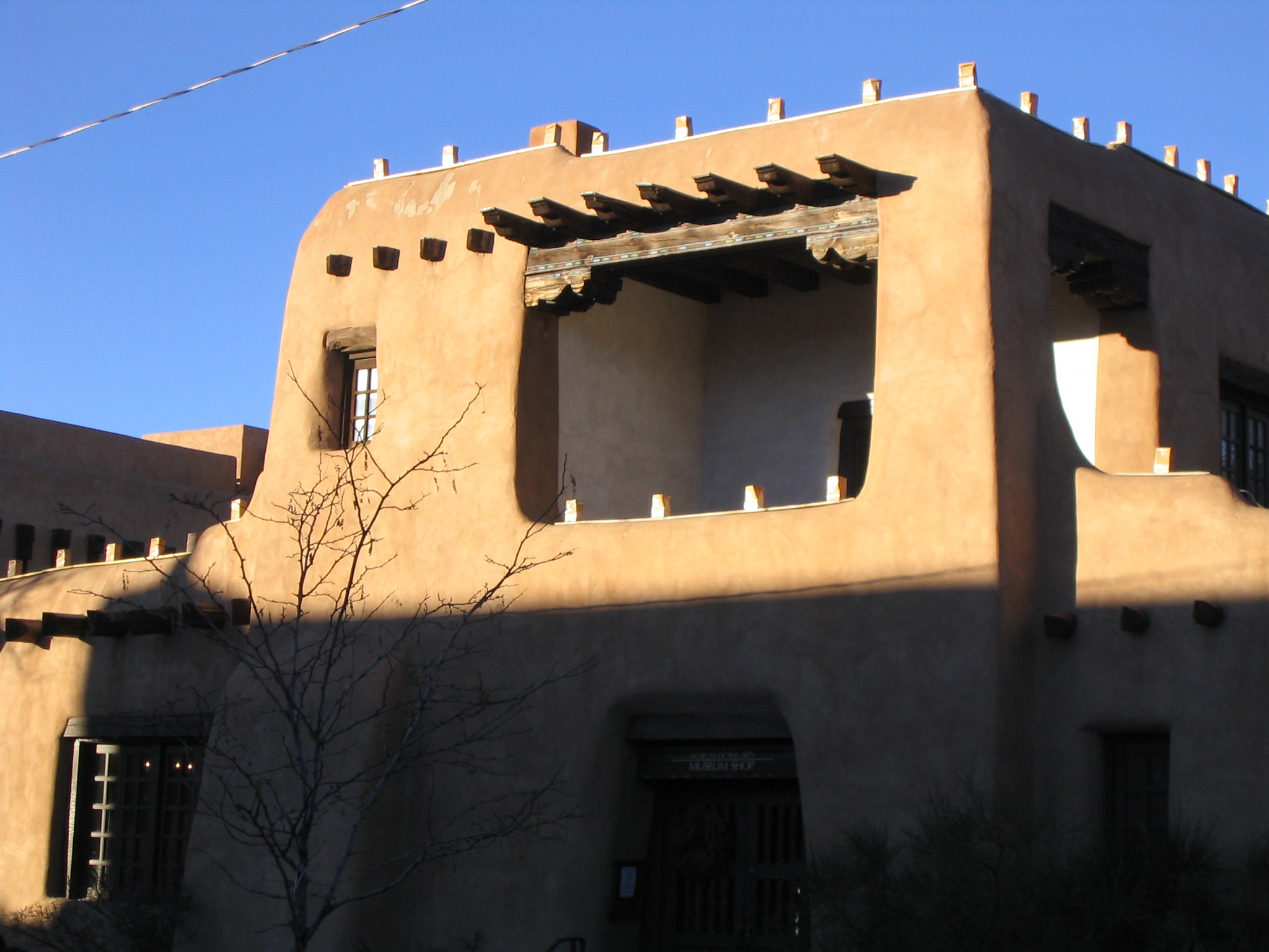
A great city requires beautiful architecture. The newest interpretations of the New Mexican style are occasionally indistinguishable from Fred Flintstone’s house in Bedrock, but more often, the architecture of Santa Fe is distinguished by simplicity, honesty of construction, and beauty of materials and form.
The standard Modernist would have us believe that the architecture is nostalgic kitsch, the construction phony, and the materials worse. This is a sham, which is said for one reason and one reason only: The architecture is traditional.
In reality, the construction is stucco on block, an economical and durable technique. Before the late 19th century, the buildings were made with adobe bricks, slathered with adobe mud, but that’s primarily because the residents of New Mexico couldn’t afford better. Forbidden to have any contact with the United States, separated from Mexico City by a three-month trek and living in the desert, they had to make do with what they had.
Adobe, being dried mud, is a bad material when it rains. The surface washes off in the rain and has to be renewed. That explains the soft rounding of the old adobe buildings, but the softness is also appropriate for the troweled application of stucco or adobe. And stucco is a beautiful and durable material.
The local adobe tint is a marvel of nature, absolutely perfect in the light of Santa Fe, just as the bricks of Venice are magical in the light of the Veneto, next to the Venetian lagoon. One of the secrets of Santa Fe is that the local color is magical there. Buildings that would be ordinary elsewhere become beautiful.
