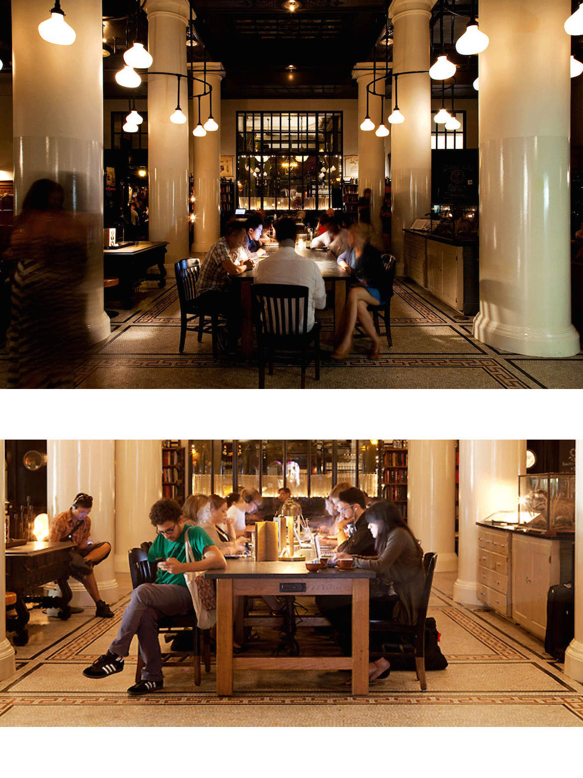
ALMOST AS SOON AS THE ACE HOTEL OPENED in New York City, the word spread among the cool tech kids and the young beautiful people that the Ace lobby was the place to meet and work. Blogs like This Is Going To Be BIG wrote about it, then Curbed, and soon it was in the mainstream media like the New York Times and New York magazine.** Nevertheless, years later, the cool kids still go there all day.
This contradicts a lot of what we’ve heard about architecture and design in New York for the last decade or so. During the time of the Bloomberg administration, New York City strongly and effectively promoted Starchitecture and shiny iconic towers as important parts of “dynamic, 21st-century cities.” At the same time, new Design and Construction Excellence policies focused on a specific vision of architecture that in the end excluded traditional and eclectic architects from city work, even though New York voters and residents would be surprised to hear that (and wouldn’t support that). A tour of places where the young and the hip hang out in the city shows that they like Classicism, Modernism, and a blend of the two, like the Ace. One could go further and accurately say that the iconic glass towers are the face of Global Capitalism, which becomes more and more unpopular among many New Yorkers of all ages. Contributing to that dislike are the Starchitect-designed, Manhattan mega-towers where non-resident plutocrats park flight capital in what London Mayor Boris Johnson calls “bullion pots in the sky” (aka, “iconic towers”).*
The Ace Hotel was designed by Roman and Williams, whose work ranges from eclectic places like the Ace lobby to traditional spots, like the restaurant at the Ace, just off the hotel lobby (none of Roman and Williams’ work is shiny modern). The Ace restaurant, called The Breslin, is genuinely traditional—many who go there probably think it’s an old New York restaurant, even though it was built in 2009. Like most Roman and Williams places, it has new furniture and fixtures with distressing to give them an “old” patina. It’s run by one of the hottest chefs in New York, and can genuinely be called hip.
Adam Platt, food critic for New York magazine, wrote, “to attract attention these days, you need a battered old saloon-style bar up front, like the one that’s been installed at the Breslin, and lots of carefully rummaged junk-store memorabilia (pictures of cows, deer antlers, porcelain figurines of pigs, etc.) scattered around the room. The waiters at the Breslin wear T-shirts, and many of them sport tattoos. The booths in the dining room are fitted with black and green leather banquettes, like a dive bar in Red Hook, and the tables are covered with butcher paper instead of linen. The cracked ceilings look the way they did when the building was still an SRO, and the room is shrouded in carefully calibrated neo-speakeasy gloom.”
In a city that has made the creation of restaurants where people want to hang out a major industry, Roman and Williams is in the top two or three firms doing this type of work. They designed Lafayette, which the New York Observer referred to as “the Great Gatsby of restaurants,” along with several other restaurants for the man who is one of the two or three restaurateurs of the moment, Andrew Carmellini. They’ve also designed a 16,000 square foot cafeteria for Facebook’s Gehry-designed headquarters, houses for stars like Kate Hudson and Gwyneth Paltrow, and popular buildings like an apartment house on one of the hottest corners in the city, just east of SoHo. The designs vary in how traditional or eclectic they are, but they never, ever look like something that could simultaneously be built in Shanghai, Mumbai, and Dubai. They all have a relationship to tradition, traditional materials, craftsmanship and the local context. That’s appropriate for restaurants where people eat artisanal and locavore food made by well-known chefs using natural ingredients.
One of the first architects to influence hipster style was New York architect Taavo Somer. “Somer,” the Wall Street Journal wrote, “has spearheaded a number of unmissable trends. Notice that it’s considered desirable in certain circles to look like a lumberjack? Feel free to credit (or blame) him for that. If the mid-aughts moment for taxidermy decor had a ground zero, it was” at his restaurant between SoHo and the Lower East Side, Freeman’s.
Freeman’s, according to the New York Times, “stood the then-prevailing night life aesthetic — a cold, plastic minimalism — on its head.” Somers modeled the restaurant “after a Colonial country inn, filled with ye-olde design touches including brass chandeliers and enough taxidermy to feel like the Lower East Side outpost of Deyrolle, the fabled Parisian shop.” More recently Somer has designed a restaurant called Isa in what might be thought of as Scandinavian Modern with reclaimed wood, underling the point made here that new and old can both be good. Somer calls it “primitive Modernism.” It’s a warm Modernism (complete with wood-burning stove) that shows off craft and carpentry and contrasts sharply with the cold machine-made and machine-like precision of the iconic glass towers. That’s not surprising in Williamsburg, known for it’s artisanal “makers.” The Ace Hotel, the Breslin, Lafayette, Freeman’s, and Isa all look like places made by human hands for human use.
This isn’t complicated. When the New York Times and the Wall Street Journal report an important architectural trend, that trend is already big and well known. Yet the architecture press ignores these trends, because the architecture media, the architectural establishment, and the architectural academy have their own agenda, promoting original genius (Starchitecture) and cultivating would-be geniuses. The placemaking, the everyday urbanism, and the ever-popular beauty of the places discussed by the Times and the Journal are irrelevant to that.
My problem here is not Starchitecture per se—Frank Gehry’s Guggenheim Museum in Bilbao is a great building that makes its visitors happy—but that only a narrow and particular “avant garde” architectural philosophy is promoted, leaving out lots of good work. I mentioned that design standards written during the previous New York City administration effectively excluded Classical, traditional, and eclectic architects from city contracts. This surprises people, but it’s true, just as it’s true that the Federal General Services Administration, responsible for choosing the architects for all Federal buildings, does the same, usually by using their well-intentioned but ideological Design Excellence standards. Take the case of Federal courthouses.
The GSA fought hard to stop the design and construction of a Classical courthouse in Alabama, which only went through because a powerful Senator took up its cause. The former head of the GSA, who wrote the Design Excellence standards, takes pride in the fact that the GSA has been successful at persuading judges to change their minds and accept aggressively Modernist courthouse designs. The judges “come to see that these buildings represent not Greek or Roman ideals but American ideals,” he wrote. “We are using American statements and iconography for the first time.” Americans from Thomas Jefferson, to Stanford White, to Daniel Patrick Moynihan would disagree, of course. There’s reason to think President Obama would too.
One of the few traditional architects who has managed to secure GSA commissions since the Design Excellence standards were adopted, Yale Dean Robert A.M. Stern, said in an interview, “Now we’re in a period when every courthouse is so different from every other one, at a time when the functions of the courts are the same. I’m famously pluralistic, but I think some of the recent GSA designs have been more difficult for the public to understand as courthouses. Once in a while, they have taken on the characteristics of art projects. I like the courthouse as a building type because it is about tradition and continuity. The shape of a courtroom, the arrangement of the ancillary spaces, all grew up side-by-side with the Constitution and with the judgments and rulings that have been made over time.”
The US Department of Housing and Urban Development made the Hurricane Sandy Rebuilding Task Force an architectural fashion show. (Full disclosure: I was on a team that was eliminated immediately.) “Thank God we kept the New Urbanists out,” New York architecture critic and kingmaker Herbert Muschamp said the morning the six finalists in the Ground Zero competition were announced. And so on and so forth.
The problem is not the Starchitecture. The problem is what a narrow focus on Starchitecture leaves out of the discussion. My sense is that more and more architects are getting tired of this narrow emphasis, and that more and more of the public are catching on too.
UPDATE: “Ninety-eight percent of the people who hang out in our restaurants hate glass towers”

* “Walkie Talkie review – bloated, inelegant, thuggish,” The Guardian
“When, for the love of God, will the word “iconic” finally die? It is more than a decade since the architect Graham Morrison questioned the way each new building strives “to be more extraordinary and shocking in order to eclipse the last. Each new design has to be instantly memorable – more iconic. This one-upmanship was, and is, a fatuous and self-indulgent game.” Yet again and again, in the planning pitch for the Garden Bridge, or the sales blurbs of buildings such as 20 Fenchurch Street (“take your place at this iconic address”), the word is wielded as one which permits no further argument.”
“San Francisco Loves to Hate the Design of Its Newest Tower,” CityLab
** Ace Hotel links to press about the hotel are here.
References to Roman and Williams:
“The Ace Hotel New York set a new standard for hotel design and innovation.”
“The pair—Robin Standefer, 49, and Stephen Alesch, 48, principals of the New York City-based design firm Roman and Williams—collaborated with Calderwood to create the much buzzed about Ace Hotel New York that opened in 2009, crystallizing vintage-cozy design trends that were emerging on the west coast and in Brooklyn. Plaid-clad 20-somethings flocked to the Ace’s dark, pubby lobby and its wood-paneled restaurant, the Breslin, with its snout-to-tail menu. It was just the right level of egalitarian comfort and locavorism that a post-crash populace needed.”
“But what exactly made the Ace such a sensation with the twenty-somethings that arrived once its doors opened?”
“’Those kids grew up with zero history,’ [Roman and Williams partner Stephen] Alesch says. “They were born in apartments, condos, shopping malls. They were driving around in Camrys. There’s no history there. Modernism was pushed so hard on them that when they hit their 20s, they decided to rebel against the aesthetics of their childhood.’ And so they embraced the Ace.”
…
“’We’re tying together threads of time,’ [Roman and Williams partner Robin] Standefer says. ‘We have reverence for history but also for modernity. We realized, perhaps five or seven years ago, that you don’t have to abandon history. And Alex was interested in rescuing things, not just discarding everything. He didn’t like planned obsolescence.’”
“And if one was wondering whom to thank for turning hotel lobbies into communal hives for high-tech movers (see the Ace Hotel), for the renaissance of tile work (the Standard, High Line) and for the popularization of once-shunned casement windows (everywhere), a thank-you note could be sent to Roman & Williams’s sixth-floor office on Lafayette Street.”
“Since the husband-and-wife team of Mr. Alesch and Ms. Standefer founded the architectural and interior design concern Roman & Williams in 2002, their aesthetic of a rugged Americana lifted from a make-believe past has gained dominion over swaths of New York, especially downtown Manhattan and Brooklyn.”
“Black-pipe flanges, filament bulbs, vintage turntables, taxidermy and other old-timey curios — these industrial-chic tropes have come to signify good taste today, and much of it can be traced to Mr. Alesch, 46, and Ms. Standefer, 47. It is a world in which the newer the space, the older it looks.”
“And designers Roman and Williams are the city’s undefeated heavyweights.”
…
“Husband and wife duo Robin Standefer (previously a production designer) and Stephen Alesch (a film set designer) have fashioned an aesthetic that is new old New York. Their dark, rough luxe interiors for Ace Hotel, the Breslin, The High Line Hotel et al are a brilliant exercise in selling New York’s identity back to itself. They’ve been the subject of a leather bound Rizzoli monograph, and their chiaroscuro style has been copied in every corner of the globe via the combination of subway tiling, dulled Deco-era brass finishings and filament bulbs. It’s easy to sneer at some of the aesthetic today as trite, but Roman & Williams is a design studio run by visionaries, up there with Gio Ponti in terms of creating holistic commercial interiors that have an enormous sense of presence. It’s not their fault that everyone copied them.”
“For a class of designers, academics, stylists, advertising execs, writers, and entrepreneurs, the Ace Hotel lobby is their collective workspace. By way of an obvious but unprecedented blend of haute hipster style (the lobby staircase features a Michael Anderson mural made of graffiti stickers, as well as a tribute to folk anthologist Harry Smith) and functionality (free Internet, unobtrusive staff ), the Ace is a model of the modern workplace in a borderless world.”
“‘For us, better than being nostalgic we are just carrying on a tradition that we like to think never ended,’ says Alesch. ‘It seems things took a detour for a long time into convenient construction and easy ways out. We see this as a continuation of say, prior to the Great Depression, before beefy, strong, solid American architecture lost its way. All of our projects tend to be a bit pro-American in design and construction, which we believe hold great value. It’s about character, you know.'”


