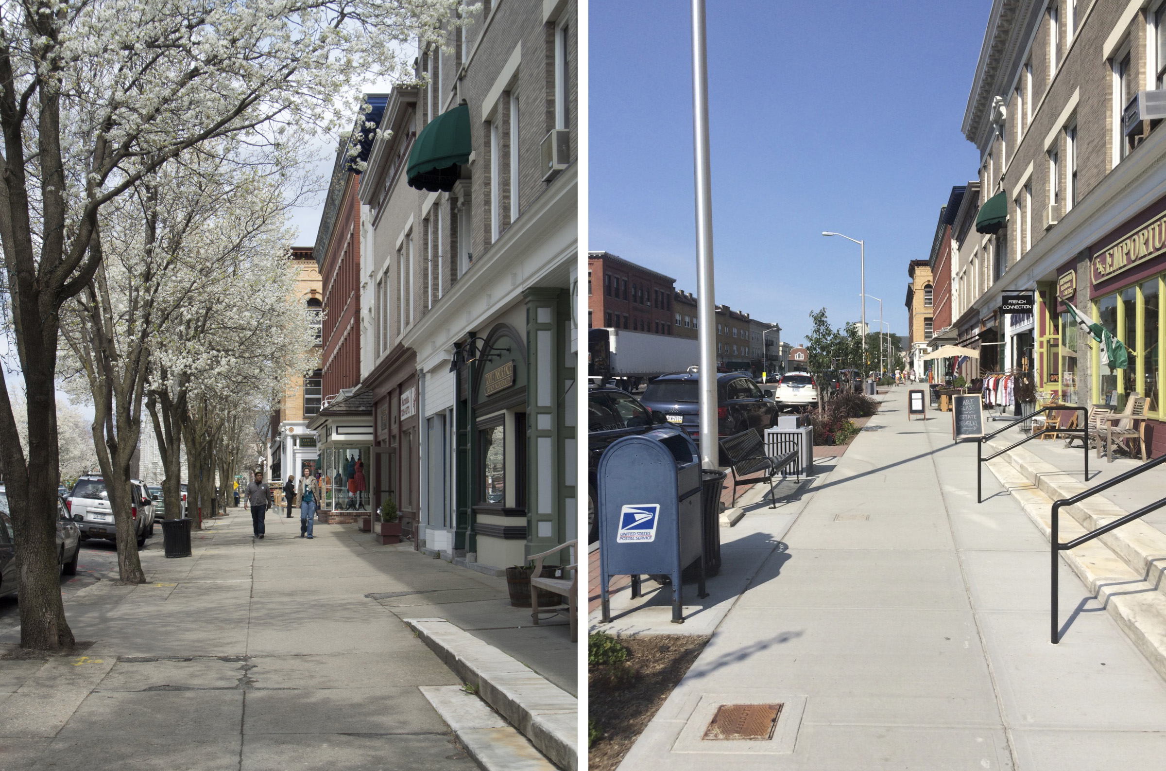
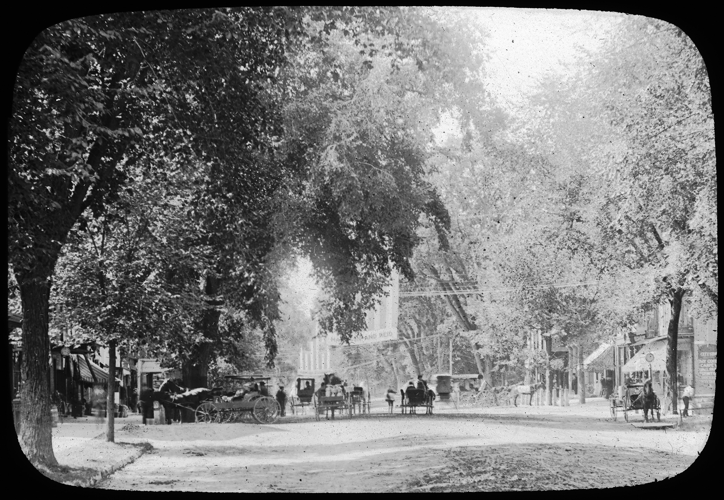
What’s the difference between traditional and neo-traditional design? Probably not what you think. More on traditional and neo-traditional design after the photos.
Neo-Traditional:

Traditional:

Jane Jacobs wrote 12 wide-ranging, brilliant books. In them she wove together ideas about cities, city life, politics, economics, and social and cultural issues, so it’s hard to succinctly summarize her contributions to tonight’s topic of affordable housing in New York City. The most directly relevant writing was in her first book, The Death and Life of Great American Cities, which came from her experience of living in Greenwich Village. As you can see on YouTube, President Obama agrees that was “the most important book ever written on cities.”
By the way, her last book, written in 2004 and called Dark Ages Ahead, predicted the possibility of a President like our President Elect. [PS*]
Jacobs wrote about affordable housing in Death and Life in a chapter she called, “The need for aged buildings.” Good cities need old buildings, she said. That’s because the cost of new construction requires landlords to charge high rents to cover their costs, rents that only wealthy tenants and the most profitable businesses can afford.


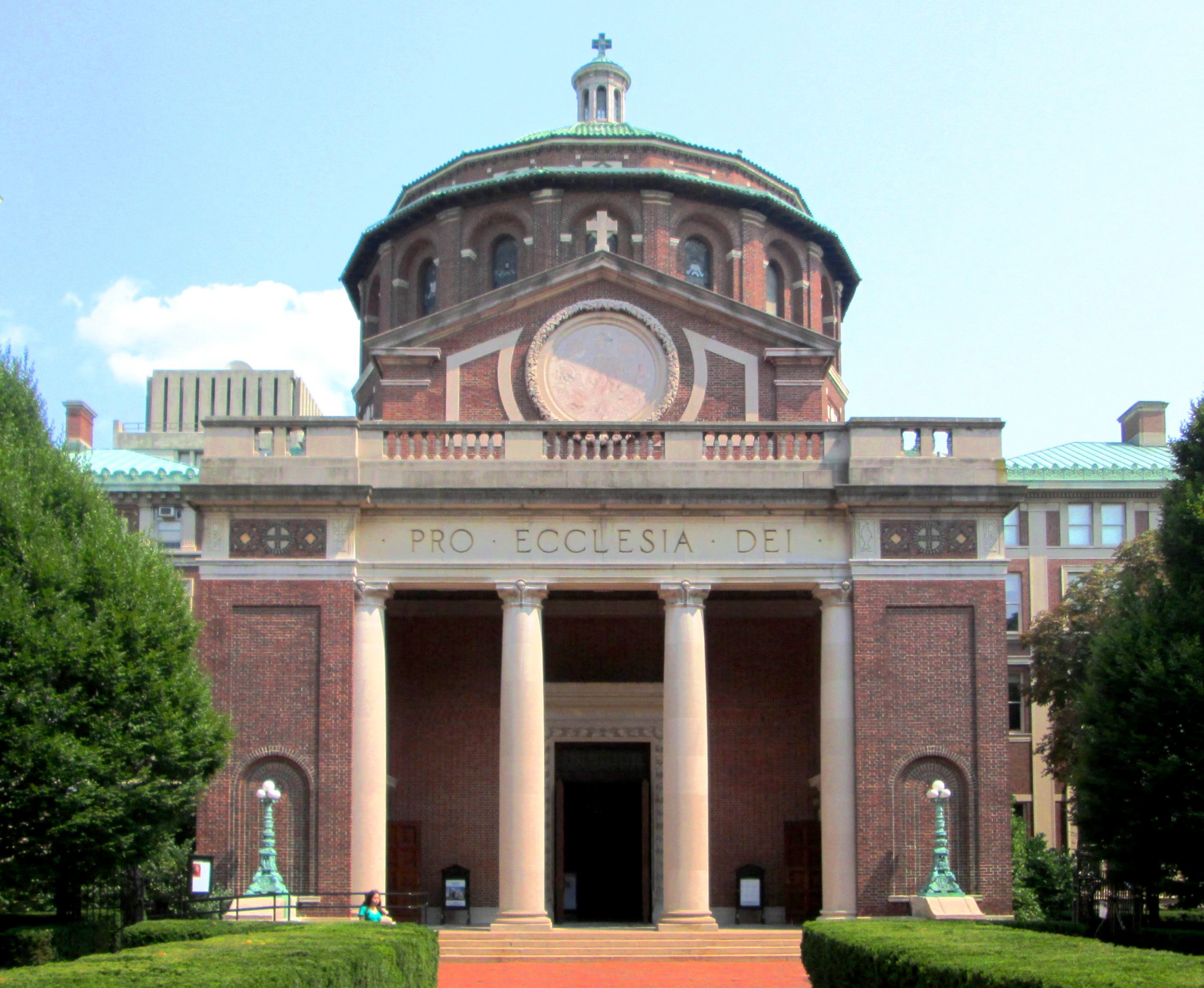
THIS IS a difficult building to photograph, and a Northern Italian Renaissanc church with a loosely Byzantine interior wouldn’t normally be my favorite. But it is so well done. The perfect proportions, the details in the entrance in antis, the powerful interior space in the Latin Cross under the dome, the Guastavino vaults and light iron details…all work together so well, convincing anyone with eyes that this is a great building. If you find yourself in the neighborhood, take a look.
There once was a tree on Nantucket,
With none of its roots in a bucket,
“That can’t be,”
Said the state DOT,
But no car has ever yet struck it.
After the jump, another Nantucket Elm Continue reading
THE BROAD crossroads where Wall Street and Broad Street come together is a beautiful space, fully the equal of medieval European plazas. Today, post-911, it’s closed to almost all traffic, because the New York Stock Exchange sits at the southwest corner of the intersection. A few weeks ago, it was the symbolic center of the NYC DOT’s Shared Streets Lower Manhattan, when one Saturday afternoon 60 blocks were designated “shared spaces,” where “Pedestrians, cyclists, and motor vehicles will share the historic streets of Lower Manhattan and motorists [were] encouraged to drive 5 mph.”
When Americans talk about shared space, someone will often say, “We’re not Amsterdam.” Well, parts of Nieuw Amsterdam / New York City make a good place to start shared space experiments. Eighty per cent of Manhattan residents don’t own a car, and only twenty per cent of Manhattan workers commute to work by private car. Then add the fact that many streets in the Financial District have restricted access: some streets are only open to residents or workers employed on the street; while other streets have tank barricades and are only open to emergency and delivery vehicles.
In the real Amsterdam, 85% of the streets today have s speed limit of 30 kilometers per hour (18.6 mph), and the other 15% have a top speed of 50 kph (31 mph). On the slower streets, pedestrian and cyclist have as much right to the street as cars and trucks, and may be anywhere on the street at any time. All of the detritus of traffic engineering—bold stripes and arrows painted on the pavement, large signs, colored bus lanes, and the like—is missing, and at the intersections, there are no stop lights, stop signs, yield signs, or crosswalks. Motor vehicles must be driven at a speed that successfully allows cars and trucks to stop for pedestrians and cyclists in the intersection.
That is “Shared Space.” That is the spirit behind the experiment the DOT tried out on Saturday, August 13, and what it hopes to try again in the future. I hope they will and therefore I make Broad Street my Street of the Day. Some of the my notes on that continue below. Continue reading
LIKE MOST NEW YORKERS, I was happy to see Occupy Wall Street arise.* We need more of that spirit in the neighborhood and preservation battles against the Lords of Real Estate that are welling up all across the city.
When I wrote Occupy Main Street for the Berkshire Record, I didn’t realize that the Record had already published a piece with the same name, at the time of Occupy Wall Street. And in Dallas, Texas, Reoccupy Main Street focused on the battle between Big Box retailers and local stores and commerce. That’s a natural issue in the home of the Berkshare and the Schumacher Institute for a New Economics.
Even though it talks about the intersection of Broad and Wall Streets, my post Occupy Broad Street is not about the 1% versus the 99%. But Broad Street in New York City and Main Street in Great Barrington share a common issue, which is how we reclaim the street for everyone, after giving it to the car the last 50 to 100 years.
Reclaiming Broad Street includes taking the streets around Broad and Wall, many of which are still dominated by cars, and occupying them for people.

NOTRE DAME DU HAUT is a work of beauty and genius. To fully appreciate that you must visit the pilgrimage chapel in the northeast corner of France. Le Corbusier put aside his machine aesthetic and principles of mechanical standardization and embraced the genius loci of the remote hilltop. Inside and out, Notre Dame du Haut stirs the soul. Continue reading
 MANY ARCHITECTURE SCHOOLS in the northeast have become more like art schools than architecture schools. They emphasize conceptual “autonomous” architecture and personal expression, and neglect materials, construction, composition, context, placemaking… the list goes on and on. When I was on a design jury with Michael Graves about a year before his death at one of the most prominent architecture schools in the northeast, Michael didn’t know what to say, because none of the students were designing architecture as he knew it (and he didn’t want to criticize them). “They’re not drawing buildings, they’re drawing pictures of buildings,” said one of the other jurors. Like me, he had been a student of Michael.
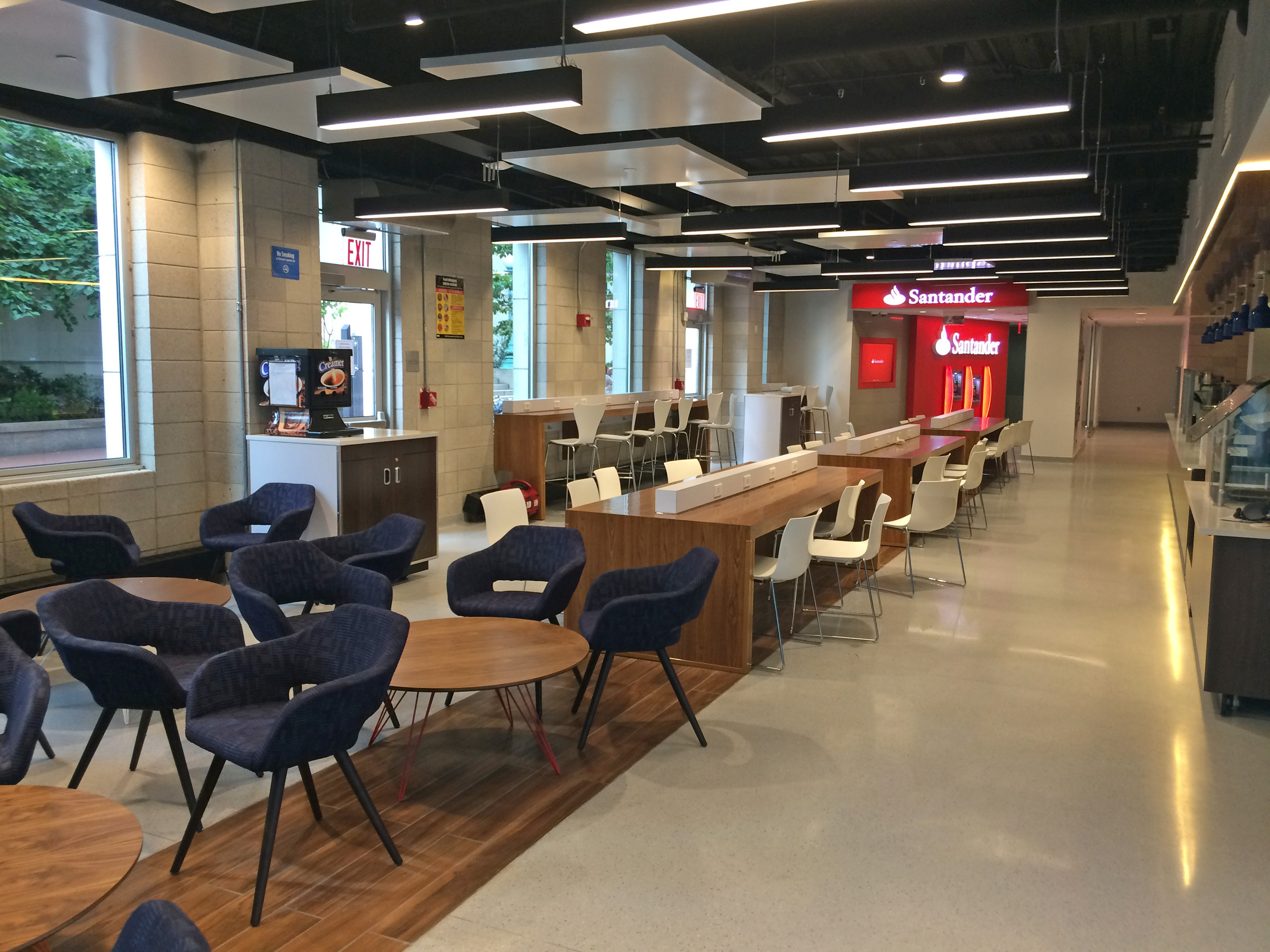
Last week, I happened to see this renovated student lounge at Columbia, which looks to me like a Delta Airlines lounge at any airport anywhere in the world. And a few days before that I was at Le District, a “French food court” (oxymoron) advertised as “New York with a French attitude.” In reality, it has all the architectural charm of the upscale, tax-free shopping mall at Heathrow Airport.
The new, nearby Eataly—a place with wonderful food—isn’t even as good as the best parts of Heathrow. It just looks like many sub-urban shopping malls. That’s shocking for a place selling the Italian brand. No country in the Western world has as much man-made beauty as Italy, where even the choice of the table cloth and the placement of the silverware on a restaurant table are frequently a work of art.
In other words, at the same time that New York has suffered an invasion of “Iconic” buildings that are identical in character to iconic buildings in other centers of global capitalism, it has also suffered a rash of interiors of inexpressive corporate Modernism identical to many other non-places around the world. A surprising number of offices in New York have a very limited range of expression at their fingertips (or mice—this work is rarely hand-drawn, which is part of the problem).
There’s some irony that this comes at the same time as the locavore movement in food, which emphasizes local ingredients and character. Of course Eataly and Le District sell locavorism, Slow Food, and “terroir” at the same time that they sell us national cuisines from another continent in shopping malls. In 2016, global commerce makes strange bedfellows. Continue reading
Firemen’s Memorial, Harold Van Buren Magonigle and Attilio Piccirilli, Riverside Drive at 100th Street, 1913.

THE FIRST YEAR AFTER 9/11, New York firemen started an unofficial memorial service at the Firemen’s Memorial on Riverside Drive. Small at first, it has grown into a large annual event. Today, the 15th Anniversary of 9/11, hundreds of New York’s Bravest turned out to honor the 343 firemen who died on 9/11. Each name and rank was read out loud, followed by the ringing of a bell. Moments of silence were observed at times like 10:28, when the first tower fell.
Great Barrington’s Main Street should be a place where people want to get out of their cars to shop, eat, and socialize—under a majestic canopy made with tall trees. That’s not what State DOTs build, however.
This story originally ran in the Berkshire Record, following earlier stories written before the rebuilding (links below).

AN OLD CHINESE PROVERB says, “The best time to plant a tree was 20 years ago. The second best time is now.” In other words, it’s not too late to fix the economic and social problems the recent rebuilding of Main Street brought to town.
Great Barrington’s Main Street has lost the curb appeal that helped make it the Smithsonian’s best small town in America. “That’s just aesthetics,” some will say — including a few who contributed to the design decisions that make the new Main Street so ugly — but what real estate brokers and developers call “curb appeal” is not just aesthetics. It has economic value and social outcomes.
Let’s look first at the trees on Main Street. Studies by groups like the city of Portland, Oregon, the Yale School of Forestry and the National Association of Realtors show that majestic street canopies like the one Great Barrington used to have increase retail sales and real estate values. Surveys in which people walk around towns and cities recording the places they like and don’t like show that we are attracted to places with beautiful trees. The book The Happy City establishes that beautiful, mature trees increase our day-to-day happiness, and a growing body of research in cognitive science is beginning to record the data behind these effects.

Occupy Main Street (@ blog.massengale.com)
The MassDOT Chainsaw Massacre
MassDOT Mistake: How Not To Rebuild Main Street
Street Design in the Berkshire Record
The Berkshire Record

THE NYC DOT’S SHARED STREETS: LOWER MANHATTAN will take place Saturday, August 13 as part of the annual Summer Streets program. Frankly, it looks like the weather will not be good, but the rain will come and go, and this will be an important step towards the type of streets and street life we need in New York. Eighty percent of Manhattanites don’t own cars, and only twenty percent of Manhattan commuters get to work by car—but we continue to give most of our public realm to motor vehicles traveling at speeds that kill pedestrians.
That’s not the DOT’s fault. They have asked the Albany legislature for measures that would be better than what we have. But the evolution of the revolution is slow.
In the meantime, come support the Shared Space effort this Saturday. It’s August and the event is only two days away, but if enough CNU NYC and CNU New York members would like, we will have a meetup during the event. Write to us at info@cnu.nyc or RSVP at http://bit.ly/nycshared.
“It is the essence of fascism to have no single fixed form—an attenuated form of nationalism in its basic nature, it naturally takes on the colors and practices of each nation it infects. In Italy, it is bombastic and neoclassical in form; in Spain, Catholic and religious; in Germany, violent and romantic. It took forms still crazier and more feverishly sinister, if one can imagine, in Romania, whereas under Oswald Mosley, in England, its manner was predictably paternalistic and aristocratic. It is no surprise that the American face of fascism would take on the forms of celebrity television and the casino greeter’s come-on, since that is as much our symbolic scene as nostalgic re-creations of Roman splendors once were Italy’s.”
“As I’ve gotten older I’ve become less and less interested in novelty or cleverness as a really important attribute of good design. It’s disconcerting when you do this sort of work to see what kinds of things have truly endured, and a lot of the time they’re not clever.”
Above & Below: Astor Court, 209 West 89th St, Charles Platt, 1915.
Below: United States Rubber Building, 1790 Broadway, Carrère & Hastings, 1912.
The Residential and Commercial Champions.
Leave suggestions in the comments if you have alternative candidates.

Seemingly every time I say something about shared space on Twitter, one or more English cyclists pop up to say “That’s not shared space.” Let’s settle this once and for all, without the character count limits of Twitter (which get worse when you add more people to the Tweet).
John Massengale
Text to follow Continue reading